
How to Interpret Your Personal Finance Dashboard
Learn how to interpret your personal finance dashboard effectively. Transform numbers into actionable insights for better financial decisions.
How to Interpret Your Personal Finance Dashboard
TL;DR:
- A personal finance dashboard consolidates your financial accounts to display key metrics like net worth, cash flow, and goal progress. Interpreting these metrics helps you make informed decisions, especially when analyzing budget variances and emergency fund progress. Regular, focused reviews ensure you stay on top of your financial health and adapt your strategies accordingly.
A personal finance dashboard is a dynamic visualization tool that aggregates your financial accounts into one place, showing net worth, cash flow, budget variances, and goal progress at a glance. Most people open their dashboard, see a wall of numbers, and close it without acting. That’s the real problem. Knowing how to interpret a personal finance dashboard turns raw data into decisions you can actually make. Tools like Thalvi, Monarch Money, and Empower automate this aggregation, but the numbers only help you if you know what they mean. This guide breaks down every major metric, explains what it signals, and shows you how to respond.
What are the key metrics on a personal finance dashboard?
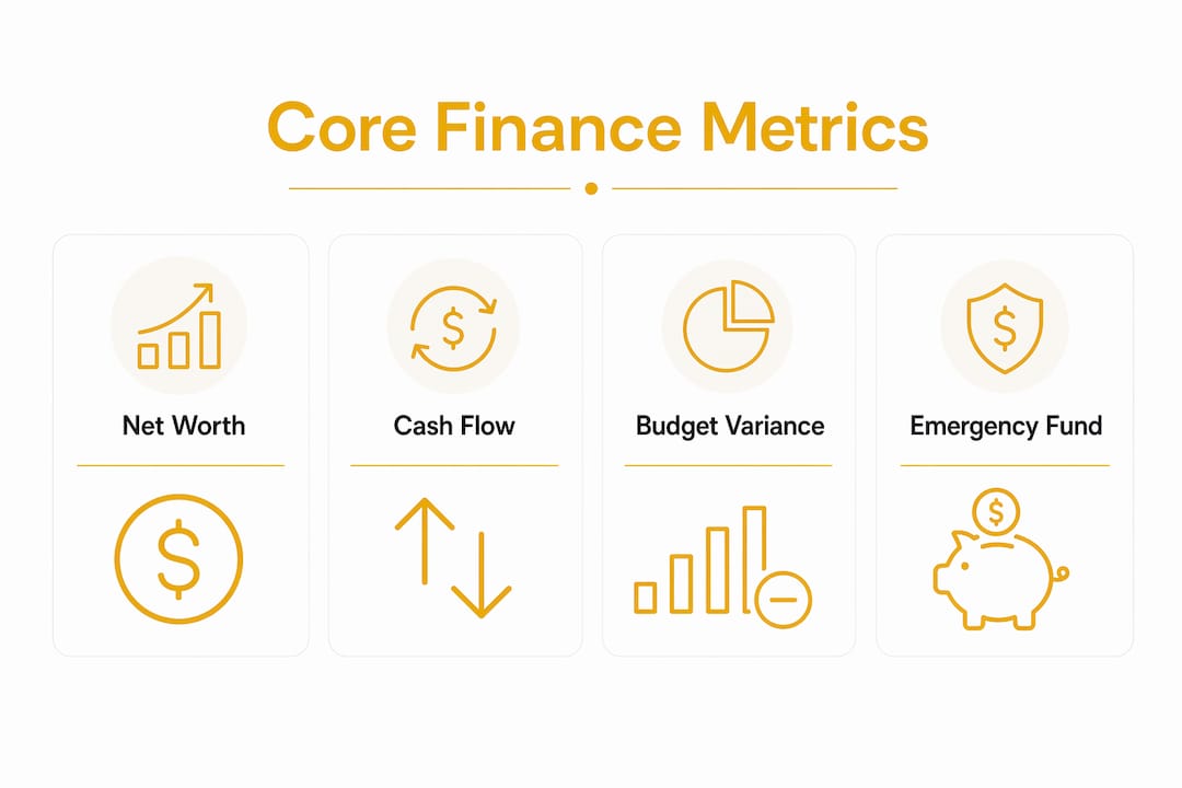
A good financial dashboard aggregates data across all your accounts and presents net worth, cash flow, asset allocation, emergency fund status, and budget variances as one connected picture. Each metric tells a different part of your financial story.

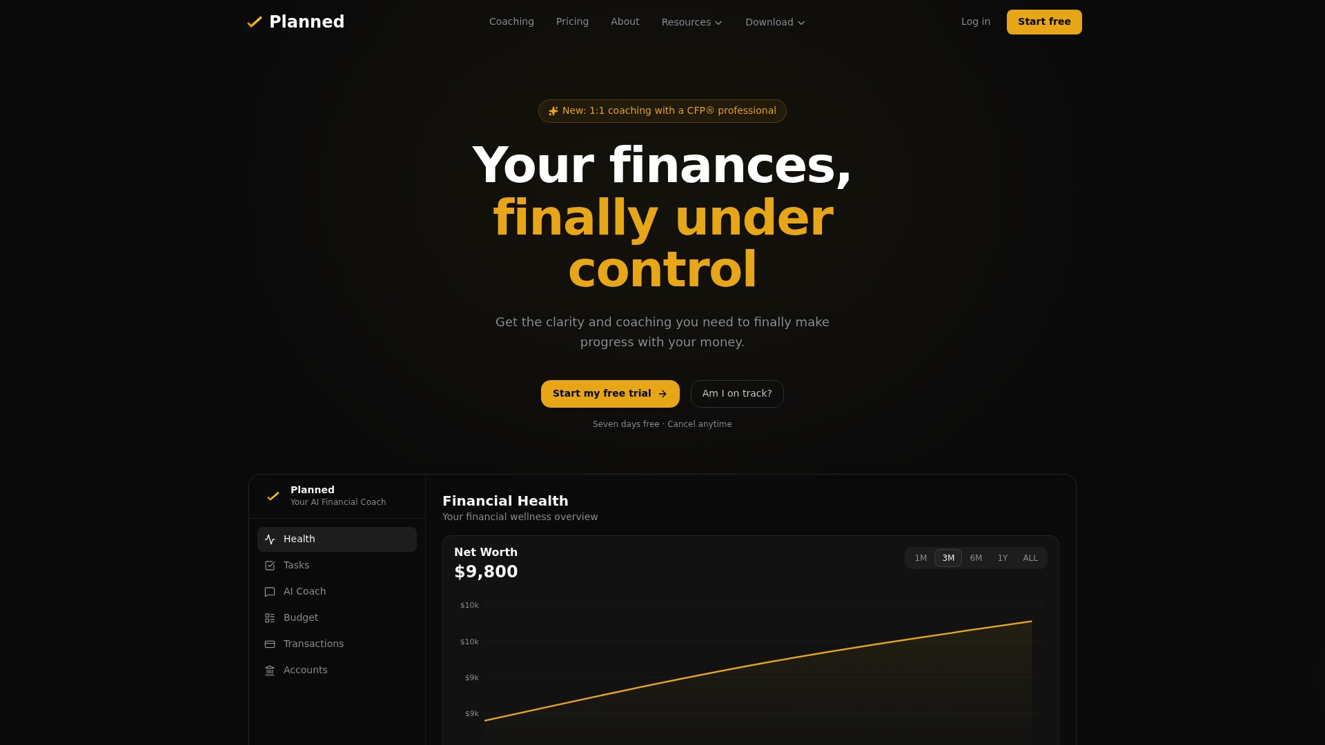
Net worth is your financial scoreboard. It equals total assets minus total liabilities. A single snapshot matters less than the trend. If your net worth grows month over month, your financial position is improving. If it shrinks, something needs attention.
Cash flow summarizes monthly income minus essential expenses. Positive cash flow signals that you have surplus to save or invest. Negative cash flow means spending exceeds income, and that gap will eventually show up as debt or depleted savings.
Investment allocation shows how your money is split across asset classes like stocks, bonds, and cash. Your dashboard compares your actual allocation to your target. When the two drift apart, that’s a rebalancing signal, not a crisis.
Here are the five metrics worth tracking on any dashboard:
- Net worth trend: Month over month change, not just the current total
- Cash flow summary: Income minus essential expenses, positive or negative
- Budget vs. actual: Planned spend compared to real spend by category
- Emergency fund progress: Months of essential expenses covered
- Goal tracking: Progress toward specific savings or debt payoff targets
Pro Tip: Track fewer metrics more consistently. A dashboard you check weekly with five clear numbers beats one you ignore because it shows thirty.
How to interpret your budget vs. actual spending data
Budget vs. actual analysis is the most actionable section of any personal finance dashboard. It compares what you planned to spend in each category against what you actually spent. The gap between those two numbers is called a variance, and variance analysis drives real decisions when you treat it as a learning tool rather than a report card.
Follow these steps to get real value from your budget vs. actual data:
- Pull your variance report by category. Look at each spending category separately. Groceries, dining, transportation, and subscriptions each tell a different story.
- Set a materiality threshold. Not every variance needs a response. A $5 overage in coffee is noise. A $200 overage in dining three months in a row is a pattern worth addressing. Dollar and percentage thresholds help you filter signal from noise.
- Diagnose the cause before choosing a response. Overspending in groceries could mean your budget was unrealistic, prices rose, or you shopped more than planned. Each cause has a different fix.
- Choose a response. Adjust the budget if the original target was wrong. Change behavior if spending was avoidable. Accept the variance if it was a one-time event like a car repair.
- Review the same categories next month. One month of data is a data point. Three months is a trend. Trends are what you act on.
How does my money actually stack up?
Most people feel behind financially but have no idea where they actually stand.
Underspending is worth examining too. If you consistently underspend on a category, that budget line may be too conservative. Reallocating that surplus toward a savings goal is a better use of the money.
Pro Tip: Start with your three highest spending categories. They drive the most variance and offer the biggest opportunity to change your financial outcome.
How should you size your emergency fund using dashboard data?
Your dashboard’s emergency fund metric is only accurate if it uses the right baseline. Essential expenses include housing, utilities, food, transportation, and insurance. They typically represent 60–75% of total spending. Using total spending as your baseline inflates your target and makes your fund look smaller than it actually needs to be.
The right target depends on your situation. Dual-earner W-2 households can typically run closer to 3 months of essential expenses. Single earners should target closer to 6 months. Variable income earners, like freelancers or contractors, may need 6–12 months because their income gaps can last longer.
Your dashboard shows emergency fund progress as a ratio. If your essential monthly expenses are $3,000 and your fund holds $9,000, your dashboard should read 3 months covered. That’s the number that matters, not the dollar amount in isolation.
Where you keep the fund matters too. A high-yield savings account at an FDIC-insured bank gives you liquidity without locking up the money. Avoid investing emergency funds in the market. The whole point is that the money is there when you need it, not down 20% during the same crisis that cost you your job.
Common mistakes in this section:
- Using total spending instead of essential spending as the baseline, which overstates the target
- Counting investment accounts as part of the emergency fund because they are not liquid on short notice
- Never updating the target as your essential expenses change over time
Read more about calculating your emergency fund to make sure your dashboard reflects the right number.
What finance dashboard features are actually worth tracking?
Automated aggregation tools like Thalvi, Monarch Money, and Empower reduce manual entry and improve accuracy compared to spreadsheets. That said, more features do not mean better decisions. Thalvi makes the point directly: a number belongs on your dashboard only when it influences your next action. If a metric doesn’t change what you do, it’s clutter.
| Feature | Manual spreadsheet | Automated dashboard |
|---|---|---|
| Account syncing | Manual entry required | Automatic via bank connection |
| Net worth tracking | Updated when you remember | Updated daily |
| Budget vs. actual | Built by hand each month | Pulled from real transactions |
| Goal progress | Calculated manually | Tracked in real time |
| Investment allocation | Requires manual updates | Synced from brokerage accounts |
The table above shows why automated tools win for ongoing use. The maintenance gap is significant. A spreadsheet you built in january may be outdated by march if you don’t update it consistently.
For beginners, the best starting point is three features: net worth tracking, cash flow summary, and budget vs. actual. Add goal tracking once you have a savings target in place. Add investment allocation once you have a brokerage account to track.
Customize your dashboard to match your current financial priorities. If you’re paying off debt, your dashboard should prominently show debt balances and payoff progress. If you’re saving for a house, goal tracking and cash flow are your most important views.
Common mistakes when using your personal finance dashboard
Most dashboard problems come from how people interpret the data, not from the tools themselves. These are the mistakes that show up most often.
- Treating the budget as a compliance exercise. The goal isn’t to stay under budget. The goal is to understand your spending patterns and make better choices. A variance is information, not a failure.
- Ignoring investment allocation drift. Markets move. A portfolio that started at 80% stocks and 20% bonds may drift to 90/10 over a bull market. Your dashboard flags this. Ignoring it means taking on more risk than you intended.
- Overloading the dashboard with irrelevant metrics. Tracking 20 categories when 5 drive 80% of your spending creates noise. Simplify until every number on your screen connects to a decision you can make.
- Failing to update targets. If your income increases, your savings goals should increase too. A dashboard with stale targets gives you false confidence.
- Avoiding the dashboard when finances feel bad. This is the most common mistake. Avoidance makes financial anxiety worse, not better. Regular check-ins, even short ones, build the habit and reduce the fear.
Pro Tip: Set a recurring 15-minute calendar block each week to review your dashboard. Consistency matters more than depth. A quick weekly check beats a monthly deep dive you keep postponing.
Key takeaways
Reading your personal finance dashboard effectively requires focusing on five core metrics, using variance analysis as a learning tool, and sizing your emergency fund on essential expenses rather than total spending.
| Point | Details |
|---|---|
| Lead with net worth trend | Track month-over-month change, not just the current balance, to see real progress. |
| Use variance analysis correctly | Set materiality thresholds and diagnose causes before changing behavior or budgets. |
| Size emergency fund on essentials | Base your target on essential expenses (60–75% of total spend), not total monthly spending. |
| Limit dashboard metrics | Track only numbers that directly influence a decision you can make this month. |
| Review consistently | A weekly 15-minute check builds the habit that turns data into financial progress. |
What I’ve learned from years of watching people misread their dashboards
Most people who struggle with their personal finance dashboard don’t have a math problem. They have a framing problem. They open the app, see a net worth number, feel good or bad about it, and close the tab. Nothing changes.
The shift happens when you stop treating the dashboard as a report and start treating it as a conversation. Each metric is asking you a question. Cash flow asks: “Do you have room to save more?” Budget vs. actual asks: “Where did your plan break down, and why?” Emergency fund progress asks: “How long could you survive a job loss right now?” Those are questions worth sitting with.
The other thing I’ve noticed is that people add metrics when they feel anxious. More data feels like more control. It isn’t. A dashboard with 30 tracked categories is harder to act on than one with 5. The best financial dashboards I’ve seen are almost boring. They show a handful of numbers, all of them connected to a specific goal, and they make the next step obvious.
If you feel lost every time you open your dashboard, the fix isn’t a better app. The fix is deciding what you’re actually trying to accomplish and building your view around that. Your dashboard should tell your financial story, not someone else’s template.
— Matt Schuberg
Planned can help you act on what your dashboard is telling you
Understanding your dashboard is step one. Knowing what to do next is where most people get stuck.
Planned connects you with CFP® certified coaches who work with your actual financial data, not generic advice. If your dashboard shows a cash flow gap, a savings shortfall, or an investment allocation you don’t understand, a Planned coach helps you build a response that fits your specific situation. Planned also offers free tools like the Savings Priority Calculator and the Invest vs. Pay Off Debt Calculator to help you turn dashboard signals into concrete next steps. Your numbers are telling you something. Planned helps you hear it clearly.
FAQ
What is a personal finance dashboard?
A personal finance dashboard is a tool that aggregates your financial accounts into one view, displaying net worth, cash flow, budget variances, and goal progress. It turns scattered account data into a single, readable picture of your financial health.
What metrics should beginners track on a finance dashboard?
Beginners should start with net worth trend, cash flow summary, and budget vs. actual spending. These three metrics cover the most ground without creating information overload.
How do I calculate the right emergency fund target from my dashboard?
Base your target on essential expenses only, which typically represent 60–75% of total monthly spending. Most households need 3–6 months of essential expenses covered, depending on income stability.
Why does my budget vs. actual data keep showing variances?
Variances are normal and expected. The goal is to diagnose whether each variance reflects a budget that needs updating, a behavior that needs changing, or a one-time event that doesn’t require action.
How often should I review my personal finance dashboard?
A weekly 15-minute review is more effective than a monthly deep dive. Consistent, short check-ins build the habit and help you catch spending patterns before they become problems.
Recommended

Financial Health Assessment Best Practices That Work
A financial health assessment follows a simple cycle: assess, plan, execute, reassess. Here are the best practices that actually move your money forward.

How to Read Your Financial Health Report in 2026
Your financial health report covers more than credit. Learn how to read the four pillars, interpret your score, and prioritize what to fix first.

What Is Financial Accountability: A Practical Guide
Financial accountability is the habit of tracking and justifying every money decision. Learn the four habits that build it and how to start this week.

Financial Plan for Your First Real Salary
Got your first real salary? A CFP® professional's 5-step plan to budget, save, and invest it, so every dollar works for you from day one.
See my financial health score.
Most people feel behind but have no idea where they actually stand. Score yourself across all 10 areas in 2 minutes.
Am I on track?